Executive Summary
A Shopify review app serving merchants globally had entered a 12-month revenue decline. Monthly recurring revenue was slipping, early-funnel churn had grown unmanageable, and the team kept shipping features that were not moving the business.
I joined as Design Manager for the Vertical, working hands-on across the full problem space: running the diagnosis, building the business case for strategic pivots, and personally designing the onboarding, paywall, and widget system, while leading the team that took those decisions through to execution.
Over the course of the role, I redirected the team from a feature-output mindset to an outcome-driven one, using user data and opportunity cost analysis to reframe what was worth shipping. The result was a full reversal of the revenue trend and a durable shift in how the team operated.
Outcomes at a glance:
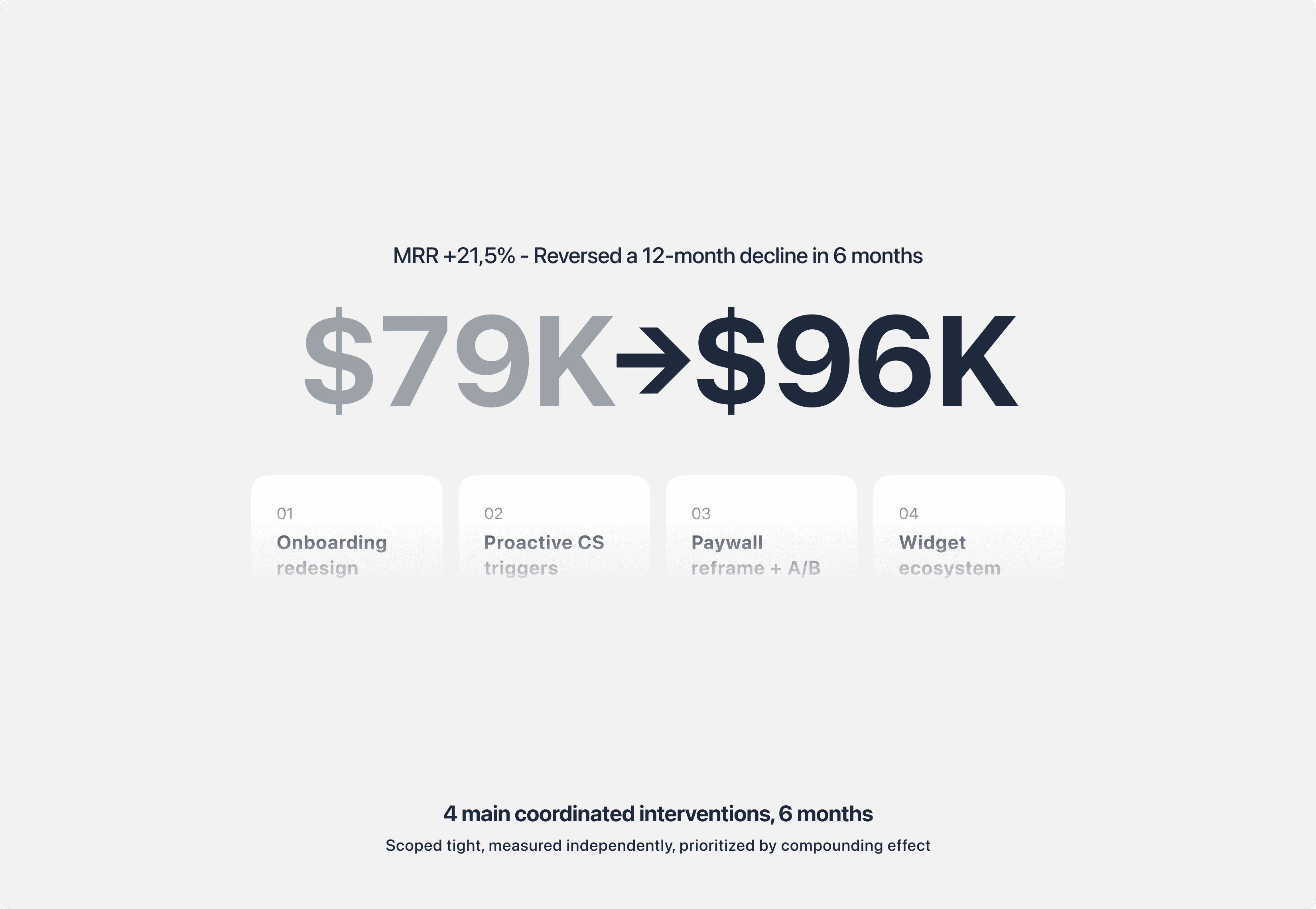
MRR recovered from $79K to $96K (+21.5%) in 6 months
Top-funnel churn cut from 65% to 23% (first 3 hours post-install)
Widget activation success raised from ~72% to 92%
Pricing anchor test delivered 3 to 4x conversion lift on the $49.95 plan
Average widget types used per merchant grew from 1.3 to 3.9
Team competency gaps closed across 3 of 6 designers through structured coaching
This case study is anonymized. Product names, proprietary assets, and specific merchant identifiers are withheld to respect confidentiality. Metrics and outcomes are real.
Diagnosis: Finding the real problem beneath the revenue drop
When I took over design for the Vertical, the product was not broken in any obvious way. It had a mature feature set, a long merchant list, and a functional paywall. But MRR had declined for 12 consecutive months, and no one on the team could point to a single root cause.
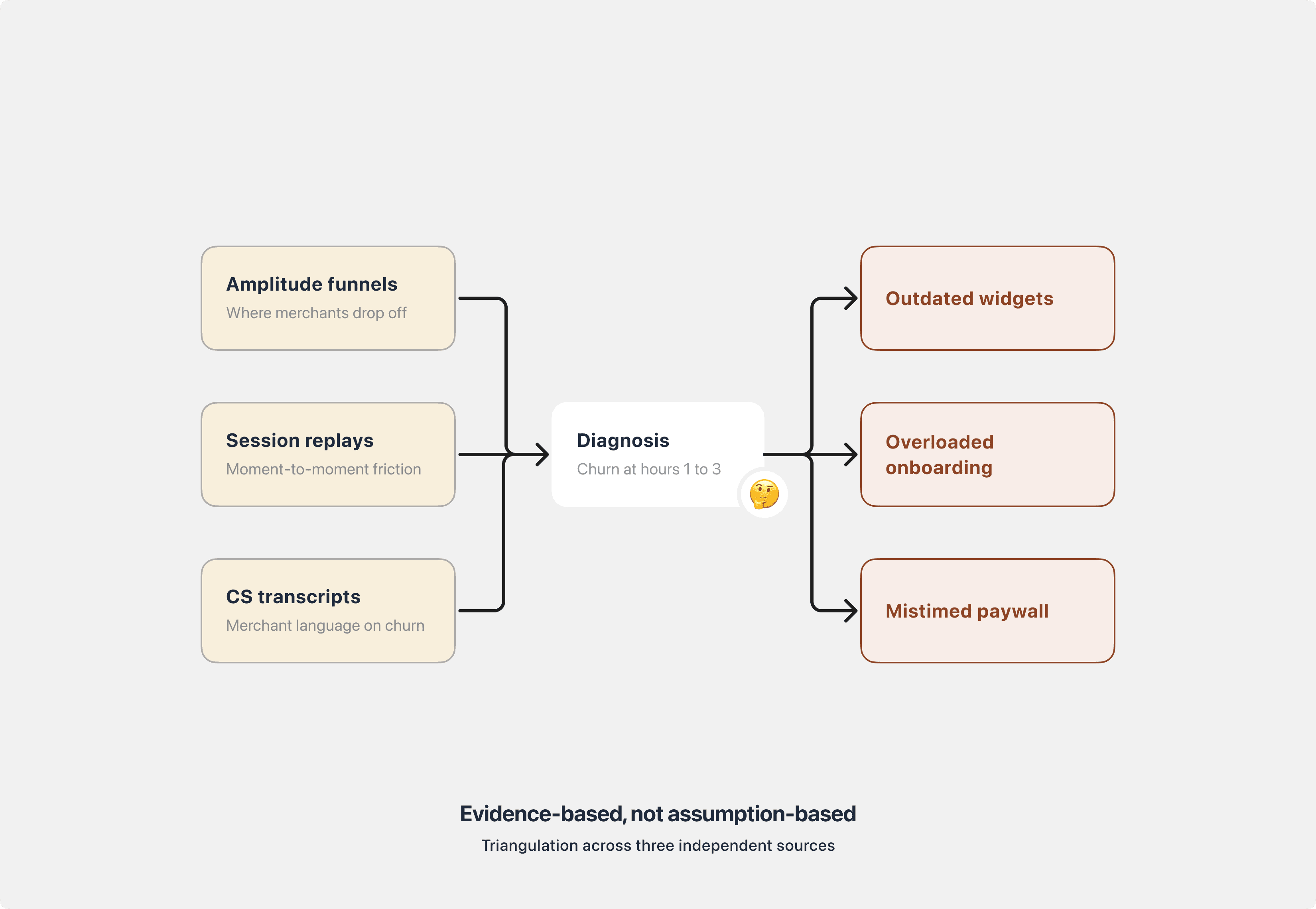
I treated the situation as a diagnostic problem before a design problem. In the early weeks of the role, I triangulated three data sources to isolate where merchants were actually leaving:
Amplitude funnels and retention cohorts to map behavior across the install-to-activation journey.
Full-session replays for installed-but-inactive merchants, to see the moment-to-moment friction that quantitative data could not explain.
Customer Success transcripts and chat logs to surface the recurring language merchants used around friction and cancellation.
A clear pattern emerged: most churn happened within the first 1 to 3 hours after install, well before merchants ever touched a paid feature. Three root causes were doing most of the damage.
Outdated widget visuals. The review widget looked dated against modern Shopify themes. Some merchants were leaving 1-star ratings specifically about CSS clashes before even evaluating the feature.
Overloaded onboarding. The flow asked merchants to configure too many things up front, forcing cognitive load before any value was demonstrated.
Poorly timed paywall. The paywall surfaced late in the journey and failed to communicate plan value at the moment of decision.
This reframed the problem entirely. The existing roadmap was built around net-new features, but the product was losing merchants in the first three hours of use, long before any new feature would ever reach them. Every engineering week spent on downstream capability was a week the leaking top of the funnel kept leaking.
That framing set up the harder decision that followed.
The Strategic Bet: Choosing core experience over the roadmap
Presenting the diagnosis was the easy part. Convincing the organization to change course was not.
The prevailing assumption across Product and Engineering was that growth would come from new capabilities. My counter-argument, grounded in data, was that core experience fixes would outperform net-new features at this stage of the product's life. I used three tools to make the case:
Opportunity cost framing. For every multi-month feature investment, I mapped what the equivalent team effort on core experience repairs could return, based on current churn and activation economics. The ratio was not close.
Competitive teardown. I benchmarked the app's onboarding, widget visuals, and paywall against direct competitors in the Shopify review category. We were behind on surface-level polish in ways that merchants were visibly punishing us for.
North Star Metric refinement. The existing NSM tracked output activity, which rewarded shipping over impact. I worked with the Head of Division to refine it around a retention-weighted activation signal, so that the team's definition of success aligned with what actually drove MRR.
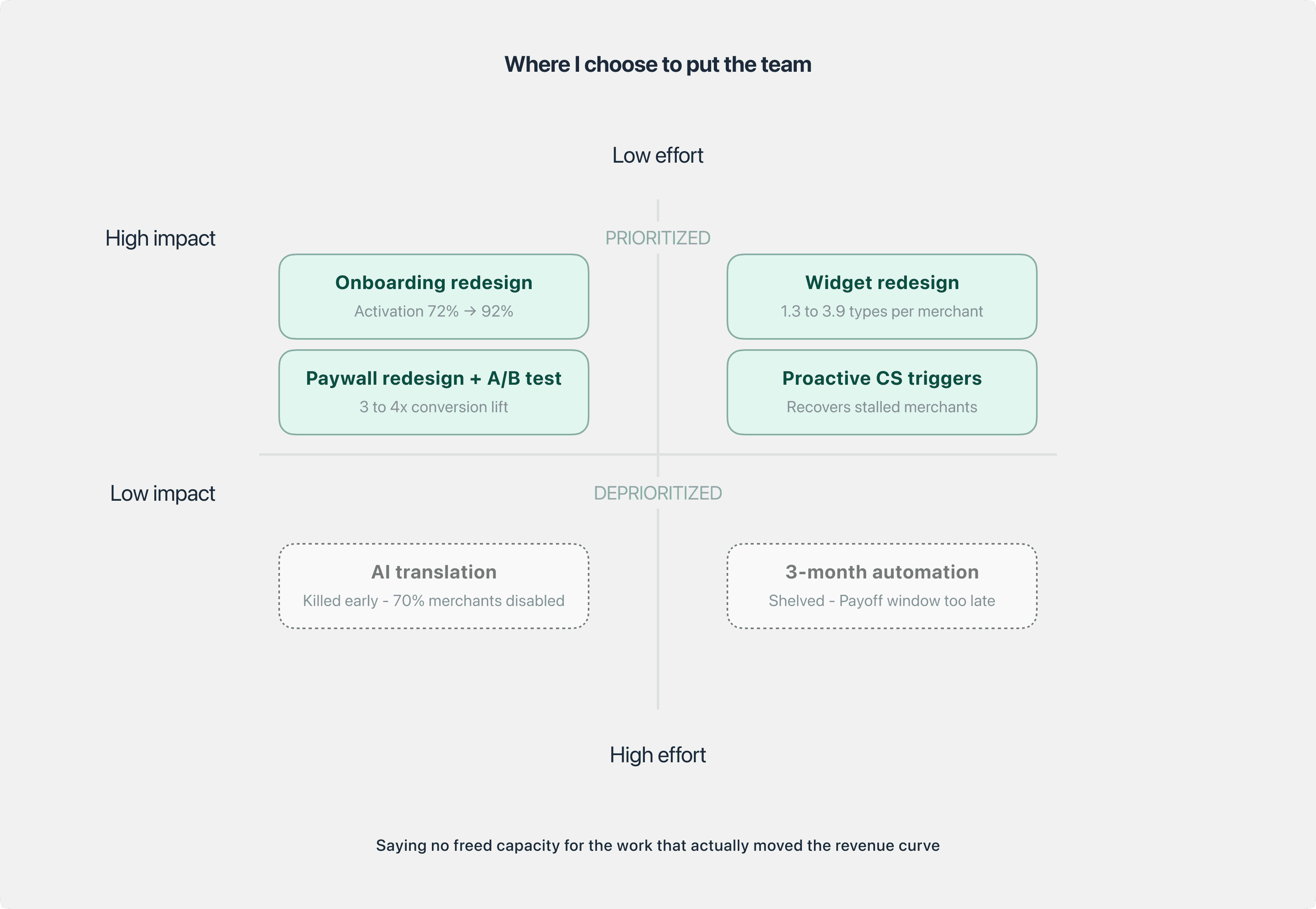
Two decisions followed directly from this reframe. Neither was popular.
Deprioritized a 3-month automation feature that had already been scoped and partially committed. Scope risk and ROI modeling indicated the payoff window would not materialize in time to affect the revenue curve.
Killed an AI translation experiment early after a rapid validation round showed more than 70% of merchants disabling it shortly after trying it. Low trust made the feature a net-negative experience.
Both calls freed meaningful team capacity and redirected it to the core experience work that actually moved the numbers. The team's cultural reset started here: saying no became a legitimate design contribution.
Execution: Rebuilding the core experience
With the team realigned around outcome, we ran 4 coordinated interventions over 6 months. Each was scoped tightly, measured independently, and prioritized by compounding effect on the activation and retention curve.
1. Onboarding redesign, reducing cognitive load
The previous flow asked merchants to configure multiple settings before the widget was ever visible on their store, forcing effort before any value was demonstrated. We redesigned it into a 3-step flow: Set Branding, Customize Widget, Enable App Embed. Each step was shaped to deliver a quick visual win that built early trust and lowered the cost of the next action.
The highest-friction step, widget activation, previously required manual theme editing and broke roughly 1 in 4 merchants. We simplified it into a one-click action using Shopify's App Embed API, removing the dependency on theme code entirely.
Widget activation success: 72% → 92%
Top-funnel churn, first 3 hours: 65% → 23%
2. Proactive CS triggers, recovering stalled merchants
Passive drop-off was being treated as unrecoverable. I worked with CS and Engineering to build behavior-based triggers that auto-flagged stalled merchants at specific friction points and routed them to targeted chat and email recovery flows. This turned drop-off into an active recovery channel without adding CS headcount, and closed the loop between upstream design decisions and downstream merchant outcomes.
The intent was not only recovery. It created a standing feedback signal: any new friction the team introduced would surface quickly through the trigger volume, giving us a fast read on unintended consequences.
3. Paywall redesign and pricing anchor test
The paywall was redesigned with a welcome sub-step to reset context, features regrouped by USP rather than by plan tier so merchants could reason about value before price, and clearer visual contrast between plans to reduce decision overhead.
We then ran a pricing anchor A/B test segmented by merchant spending behavior. For high-willingness-to-pay segments, we reversed the default plan order so the highest plan appeared first, reframing it as the reference point rather than the outlier. In the test variant, the highest plan converted 119 times vs 31 in control, a 3 to 4x lift on the $49.95 plan.
Median paywall decision time: 1m 55s → 45s (-61%)
4. Widget visual redesign and ecosystem consolidation
The review widget was redesigned to fit modern Shopify theme conventions, resolving the long-standing CSS compatibility complaints that had been driving 1-star reviews. Beyond visual updates, this was also a design system decision: the new widgets shared a consistent component foundation, which reduced both merchant-side CSS conflicts and internal maintenance load.
Alongside the redesign, I led an audit of the full widget catalog. We retired 2 legacy widget types with near-zero adoption and consolidated the offering from 9 to 7, simplifying the merchant's mental model and freeing Engineering from maintaining dead code paths.
Average widget types used per merchant: 1.3 → 3.9 (~3x)
Together, these 4 interventions produced the MRR recovery from $79K to $96K (+21.5%) over 6 months, on a trendline that had been declining for the previous 12.
Leadership System: Scaling beyond any single design
The outcomes above were downstream of how the team was set up to operate. Shipping a redesign is a project. Building a team that can diagnose, prioritize, and defend decisions on its own is a capability. Three leadership investments carried as much weight as any individual intervention.
Competency mapping and structured coaching
Early in the role, I assessed each of the 6 designers against a competency framework covering craft, systems thinking, cross-functional influence, and validation design. The mapping made gaps legible against role expectations rather than against opinion, and made growth a shared conversation rather than a performance judgment.
For the designers whose mapping showed meaningful gaps, I built structured 1:1 coaching plans with specific development outcomes tied to defined review checkpoints, not vague goals. Progress was visible across the following review cycles in every case.
Design critique as an evidence ritual
I established a regular design critique cadence where every decision of significance had to be defended with evidence: Amplitude data, session replay, CS signal, or a structured experiment. The ritual was not about policing quality. It was about changing the team's default posture from "here is my solution" to "here is the problem, the evidence, and why this is the right bet."
By the end of the engagement, the team was proposing deprioritizations on its own and pushing back on PO requests with data rather than opinion. That capability is what persists after any single designer leaves.
AI integrated into the design workflow
I integrated AI tooling into multiple stages of the design process:
User research synthesis and JTBD mapping
First-draft PRD and spec writing
Prototype generation for faster validation loops
The productivity gain was real, but the more important effect was structural: AI absorbed the execution-heavy tasks that had been consuming senior designer bandwidth, freeing that bandwidth for architecture, critique, and strategic partnership with Product. The team's highest-leverage capacity went back to where it should always have been.
Taken together, these three investments were the operating system the execution work ran on. The design outcomes would not have held without it.
Outcomes and Reflections
Consolidated outcomes:
Metric | Before | After | Change |
|---|---|---|---|
MRR | $79K | $96K | +21.5% |
Early churn (first 3 hours) | 65% | 23% | -42pp |
Widget activation success | ~72% | 92% | +20pp |
Paywall decision time | 1m 55s | 45s | -61% |
Widget types used per merchant | 1.3 | 3.9 | ~3x |
Paywall conversion, high-WTP segment | Baseline | 3 to 4x | Segmented lift |
What I would do differently:
Diagnose faster. The diagnosis phase was defensible given the complexity, but I could have compressed it by parallelizing the competitive teardown with the data triangulation.
Surface the deprioritization case earlier. The call to shelve the 3-month automation feature was the right one, but the internal conversation would have been lighter if I had framed the opportunity cost argument in the first week rather than several weeks in.
Invest in the design system in parallel. We shipped the widget redesign successfully, but without a stronger component foundation underneath, each downstream improvement took longer than it should have. An earlier design-system investment would have compounded across every intervention.
Principles I carried out of this work:
Diagnose before prescribing. In a feature-factory environment, the strongest strategic move is often refusing to design until the problem is actually understood.
Saying no is a design contribution. Deprioritizing the automation feature and killing the AI translation experiment were among the highest-leverage calls of the year. Neither produced a single shipped pixel.
The team is the product. Core experience improvements compound, but a team that can diagnose, prioritize, and defend decisions independently compounds faster.